Breadstack Cannabis
Refining the product design
to accommodate a new user profile
Refining the product design to accommodate a new user profile, considering their unique characteristics and constraints
Web app • Design Refinement
Overview
The Breadstack Cannabis platform is a customized version of the existing Breadstack software, tailored for cannabis retail stores. Driven by the unique characteristics of retail establishments, such as physical locations and diverse shipping methods like in-store pickup, this modification was heavily influenced by COVA integration constraints. This project prioritizes revamping key interfaces to enhance user experience across main modules.
My role
Secondary research, Sketching(Ideation), Wireframing, Prototyping
Background Story
Noticing problems of previous approach
Initially, Breadstack aimed to create a unified hub for multiple eCommerce platforms and stores, focusing solely on eCommerce functionality. However, as we transition into retail, many assumptions no longer hold. For example, local retailers offer shipping methods like in-store pickup, and warehouses now function as individual retail locations with separate inventories.
Our initial strategy to adapt the platform for cannabis solutions with COVA integration led to minimal changes, resulting in many inactive fields and an overwhelming UI. This patchwork approach created a disjointed solution that failed to meet user needs effectively.
Strategy
Our goal
"Enhance the user experience for cannabis retail store owners by updating the main modules' UI and integrating cannabis-specific data, making the platform into a premier solution for the cannabis industry."
Scope
Integration with COVA system constraints
The project must seamlessly integrate with the COVA system, imposing constraints such as non-editable contents for certain data fields.
Adhere to existing product branding
The project must maintain consistency with the branding of the existing product, ensuring a cohesive user experience and visual identity.
Retail location-specific data
Some data fields are specific to retail locations, requiring special consideration and handling within the system.
Solution
Multiple rounds of ideation
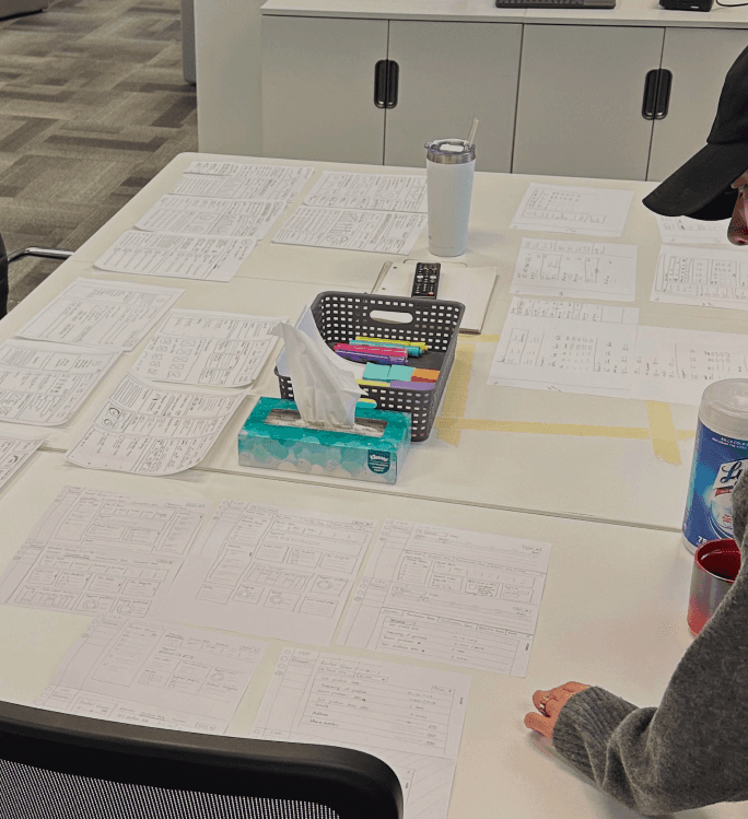
We held ideation sessions involving card sorting, sketching, wireframing, and mockup design for each module. Feedback from these sessions refined our design scope and clarified the features for the redesign.
Ideation sessions and diverse concept designs
Ambitious approach
Realizing the limited use of the Fulfillment module, we saw an opportunity to refine the order processing workflow by integrating fulfillment directly into the Order module. This allows users to manage orders from start to finish on the order details page, streamlining the process and improving efficiency. Since users often do not distinguish between warehouse and store operators, merging fulfillment and order functionalities enables all users to manage packages within the Order module.
Effort for combining Order & Fulfillment modules
Final Design
Products module
We updated the product publish settings to be more intuitive, making storefront catalog management easier. We improved the UI to clarify product variations and show location inventory availability. Non-editable fields were changed from disabled text boxes to simpler text, enhancing navigation and clarity.
New Products module
Orders module
Due to time constraints, we decided against merging fulfillment and order functionalities. We improved the order list page by collapsing the advanced filter by default, freeing up space. On the order details page, we placed the order summary at the top for quick access and made order status changes action-driven to align with the workflow.
New Orders module
Customers module
We collapsed the advanced filter by default on the customer list page to minimize distractions. On the customer details page, we restructured information for better usability and refined insights by removing overlaps and adding retail location-specific data, providing a clearer understanding of customer behavior and preferences.
New Customers module
Analytics module
We enabled users to view data by individual retail location and aggregated across all locations, offering insights at both granular and macro levels. We also expanded the module to compare online and in-store sales data, providing valuable insights to optimize business operations.
New Analytics module
Project Outcome
Growth in various client performance metrics
This redesign project greatly improved the user experience and software interface, offering a more tailored solution for our clients. As a result, they fully transitioned from their previous software to our product. Now, all retail locations under the client's brand use the Breadstack Cannabis solution, simplifying the management of customer data, orders, and inventory.
46% average available inventory increase
26% decrease in inventory return rate
37% surge in new customers
14% boost in total orders
What happened next?
Following the release of the product update, the team recognized the untapped potential of integrating order and fulfillment functionalities. This realization was further reinforced by feedback from stakeholders, prompting us to revisit the concept. Motivated by this feedback and recognizing the opportunity to cater to diverse user profiles, we embarked on further exploration for future product updates.
Takeaways
01.
Involve engineering early to understand limitations better
Involving engineering upfront proved to be crucial during our project, particularly when suggesting integration between the order and fulfillment modules. Without prior consideration of technical limitations within our time constraints, we encountered challenges that could have been mitigated with engineering input. This experience highlighted the importance of collaboration between design and engineering teams from the outset.
02.
Iterate, iterate, iterate! (based on feedback)
The importance of feedback and iterations during the ideation phase became evident throughout our project. By actively seeking and incorporating feedback during the early stages, we were able to refine our ideas and solutions iteratively. This iterative approach facilitated the development of more robust and user-centric designs. Embracing feedback as an integral part of the ideation process enabled us to identify and address potential issues early on, leading to more successful outcomes in subsequent phases of the project.
03.
Importance of critical thinking for product enhancement
Critical thinking played a significant role in our efforts to improve the product further. By challenging assumptions and exploring alternative approaches, we were able to uncover new opportunities for enhancement and innovation. This process of critical thinking encouraged us to question existing norms and push the boundaries of conventional design solutions.


