CanFleet
New retail delivery solution
from a sunsetting courier product
Full product design • Responsive web
Overview
CanFleet is a local delivery solution for retail stores. It provides tools to create delivery tasks, assign to drivers, and monitor deliveries. This project focused on harnessing and rejuvenating the company's existing technology and features to create a new solution tailored for a new group of target users and their needs.
My role
Secondary research, User journey mapping, IA structuring, Ideation, Prototyping, Responsive design
Project outcome
500+ customers
13,000+ delivery tasks
350,000+ km tracked
How it Started
Finding opportunity from sunsetting product
Initially, our company provided a local courier service for retail stores with two key components: an internal monitoring system for drivers and a user-friendly platform for customer delivery requests. However, we decided to discontinue the courier service due to changing market conditions.
Recognizing the value of our technology and platform, we researched new opportunities to repurpose these assets, leading to innovative solutions beyond our original service model.
Previous courier service product
Higher demand for fast delivery, yet business owners aim to retain control over the delivery experience
Over 50% of online shoppers don't want to wait 2 days for fast shipping
41% of online shoppers are willing to pay extra for same-day delivery
63% of online shoppers care about guaranteed delivery dates and times
Business owners fear the loss of control when using 3rd-party delivery
Strategy
Target users
Retail business owners & Delivery drivers
This project primarily aimed at retail store owners looking to improve customer experience with expedited local delivery. While they have the resources to manage delivery services, they lack the tools for efficient scaling. Delivery drivers, responsible for carrying out these tasks, are another key audience.
Our goal
"Provide users with the necessary tools to
establish and manage their own delivery services, supporting them throughout their journey and streamlining operations to reduce costs and efforts."
Scope
The project must preserve the core brand identity of the original product and utilize its existing components. To ensure users can receive delivery tasks from storefront orders, the product needs to integrate with WooCommerce, which is required for handling these orders.
Solution
Updating structure
Based on insights from previous processes and team meetings, we developed essential modules and features for the new product. We then created an information architecture to clarify our vision and ensure smooth communication with stakeholders and the product manager. This led to a streamlined and user-friendly redesign of the previous courier product's structure and navigation.
IA
Ideating by simplifying
In accordance with the project scope, we initiated ideation phase by simplifying elements and features from the original courier platform.
Marking elements to exclude
Final design
As part of a strategic shift, the product was rebranded to align with its new purpose. Through extensive team feedback and iterations, we developed the final high-fidelity designs with detailed flows.
Account creation page
Live Map/Tracking module
Task list module
Settings
Driver app screens
Project outcome
The initial product release was a success as we launched the platform within the defined scope and constraints. We received positive feedback from users who found the product simple and easy to use for managing their delivery tasks.
500+ customers
13,000+ delivery tasks
350,000+ kilometers tracked
What Happened Next?
Iterations through feedback
Following the completion of the initial phase of product development, we continuously incorporated minor UI updates based on feedback from users and stakeholders. Moreover, we introduced additional modules, including 'Address Book' and 'Insights', to enhance users' operational capabilities.
Address Book module & Updated create task modal
Insights module
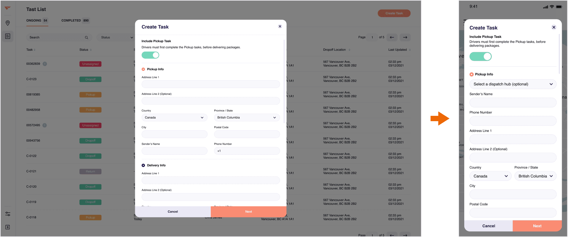
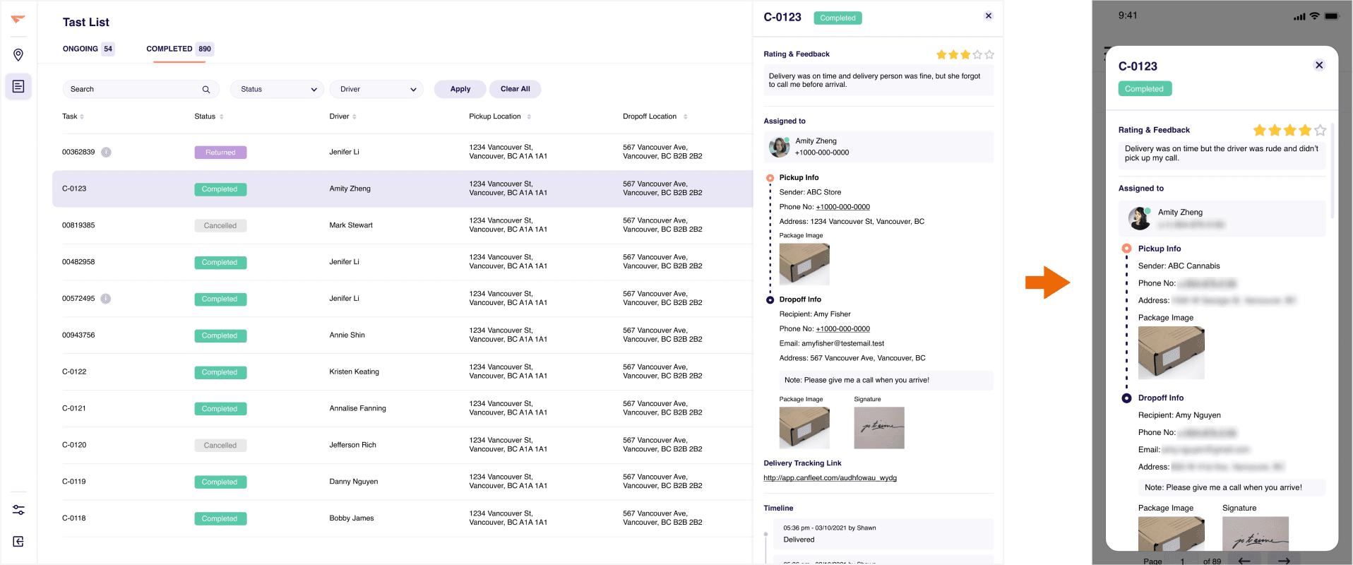
Responsive design
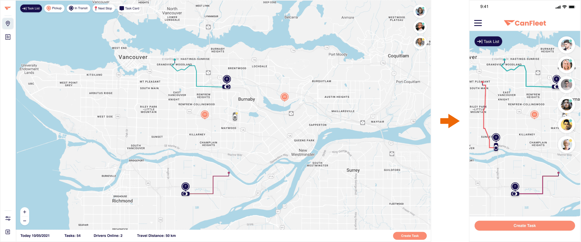
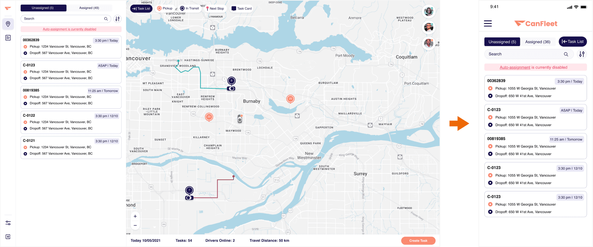
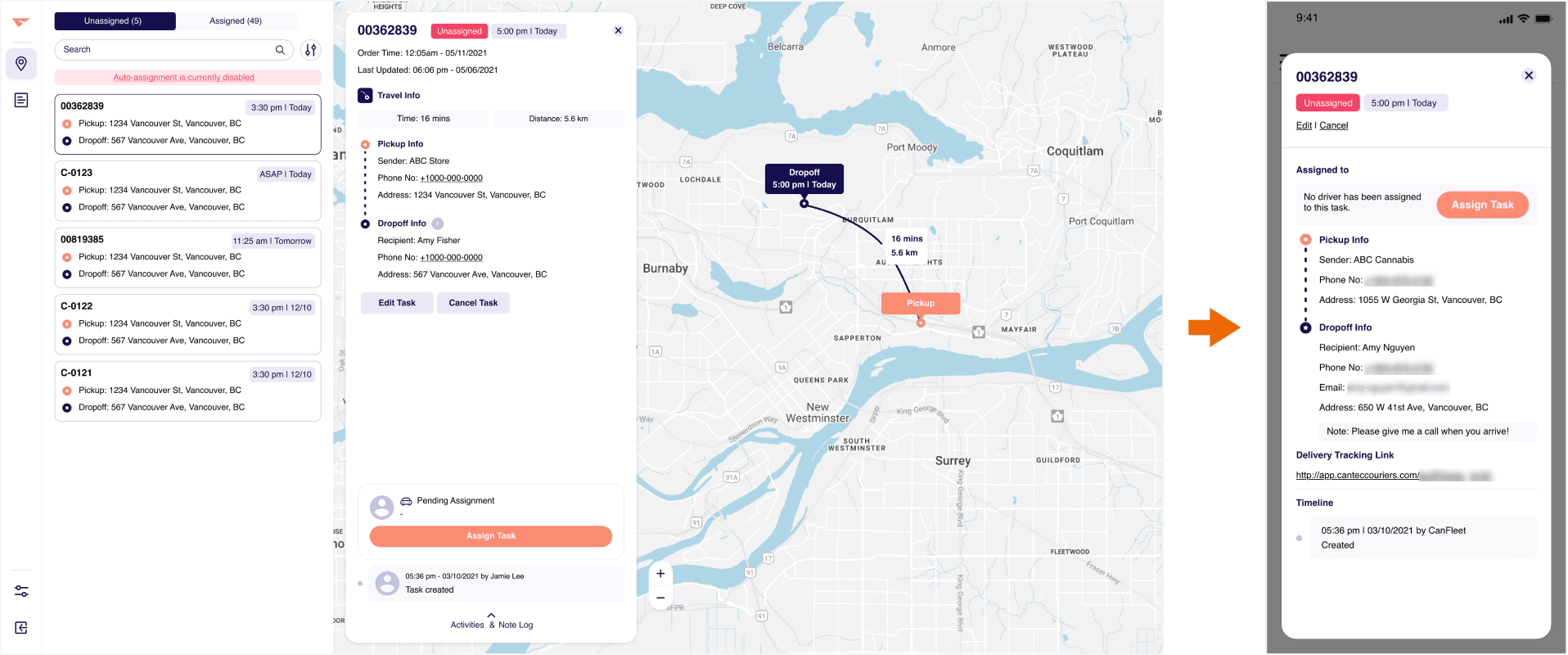
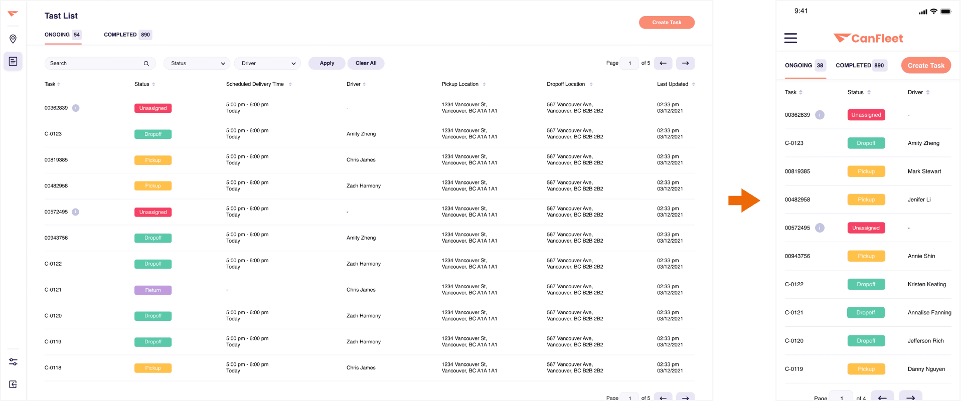
In response to user requests for mobile accessibility, the product, originally designed for the web to accommodate features like live maps and detailed task lists, was adapted for mobile platforms through responsive design.
Live tracking - Web screen(left) and mobile responsive screen(right)
Live tracking task list - Web screen(left) and mobile responsive screen(right)
Ongoing task details - Web screen(left) and mobile responsive screen(right)
Task list - Web screen(left) and mobile responsive screen(right)
Create task - Web screen(left) and mobile responsive screen(right)
Completed task details - Web screen(left) and mobile responsive screen(right)
Takeaways
01.
Power of setting target user
The power of target user setting was instrumental in revitalizing the product's purpose and relevance. By identifying and prioritizing different target user groups, we were able to reframe the product's utility, breathing new life into its functionality.
02.
There is always room for improvement (through iterations!)
The project's journey emphasized that even after completing the initial phase, there's always room for improvement through ongoing iterations. Embracing iteration as a continuous process beyond the project's initial stages allowed us to maintain momentum, drive improvements, and ultimately deliver a more refined and impactful solution.
03.
Projects don't always follow the standard procedure taught in theory
Real-life projects often deviate from the standardized procedures taught in theoretical frameworks. While idealized methodologies provide valuable guidelines, the reality of project execution frequently necessitates adjustments and compromises to accommodate constraints, timelines, and stakeholder expectations.


