I'm decisive
Creating a task-specific mobile solution
that facilitates lightweight decision-making
Native Mobile app • Task-Specific
Overview
Are you an indecisive person who tends to say “I’m okay with anything” when making a decision?
‘I’m decisive’ is a mobile app designed for helping indecisive people by making the decision-making process more manageable and less troublesome.
My role
Secondary research, User interview, Persona development, User experience mapping, Sketching(Ideation), Wireframing, Prototyping, User testing, UI research/development
Discover
Problem space
Making decisions with indecisive people can be frustrating, especially when planning activity as a group. Unfortunately, it can negatively affect people involved in the repetitive and time-consuming process, such as friends, colleagues, partners, and family.
Secondary research
20% of adults are INDECISIVE
According to the research, having too many options leads to indecision, which in turn causes anxiety, worry, regret, and shame, negatively impacting quality of life and social interactions. Starting with small decisions and adding playfulness, such as flipping a coin or drawing lots, can help reduce indecisiveness.
Interview findings
Reason for indecisiveness
People's indecisiveness often stems from having too many options, which leads to confusion about what they truly want, and from being overly concerned with others' satisfaction.
Frustration
Discussions longer than 20 minutes can become tiresome and may lead to arguments, resulting in familiar dinner options and limiting opportunities to try new places.
Helpful method
An indecisive person prefers using methods like coin flips or random drawings for simple decisions, finding them helpful for making choices quickly and stress-free.
Organizing the insights helped me identify a key focus for the project.
I chose to concentrate on the "Helpful Method" for social events among groups and formulated the following question:
How might we
make decision-making easier for indecisive people
in order to streamline the group dine-out planning process?
Define
Persona
By synthesizing and analyzing the research data, I created a persona that can represent my user segment, for whom I will design the best possible experience.
Experience mapping
From the perspective of Claire, I made the experience map of her when deciding for group dine-out to get a more precise idea of the frustration, goal, and opportunities to improve the experience for her.
Task selection
I translated Claire's user stories into tasks and created a task flow diagram to visually describe the product flow. Her tasks include selecting the area and criteria for group dining, receiving random suggestions, and checking detailed information before sharing options with the group.
Develop
Exploratory sketches
I visualized the product's functionality into initial sketches based on user stories, a task flow diagram, and a UI inspiration board that I created to acquire inspiration from other applications.
Solution sketches
By comparing concept sketches, I decided on the final solution sketch to turn into the initial prototype.
Wireframes
I translated my solution sketches into mid-fidelity greyscale wireframes using Figma. After initial wireframing and feedback sessions, I refined the design scope, gaining a clearer understanding of the features to include in the redesign.
Deliver
Rounds of usability testings
Using the initial prototype, I conducted usability testing with multiple participants.
100% Task completion
But…
Opportunities
It can be confusing what task to do on the map screen without a title and clear instruction.
The order of preference filters may need to be rearranged.
Having all preferences settings on one page looks crowded.
Wording on some screens can be confusing.
The visual hierarchy of the map screen can be confusing due to the ‘Adjust Pin’ button.
Revised wireframe
I revised the prototype by reflecting feedback from the user testing sessions and the design prioritization matrix.
High-fidelity prototype
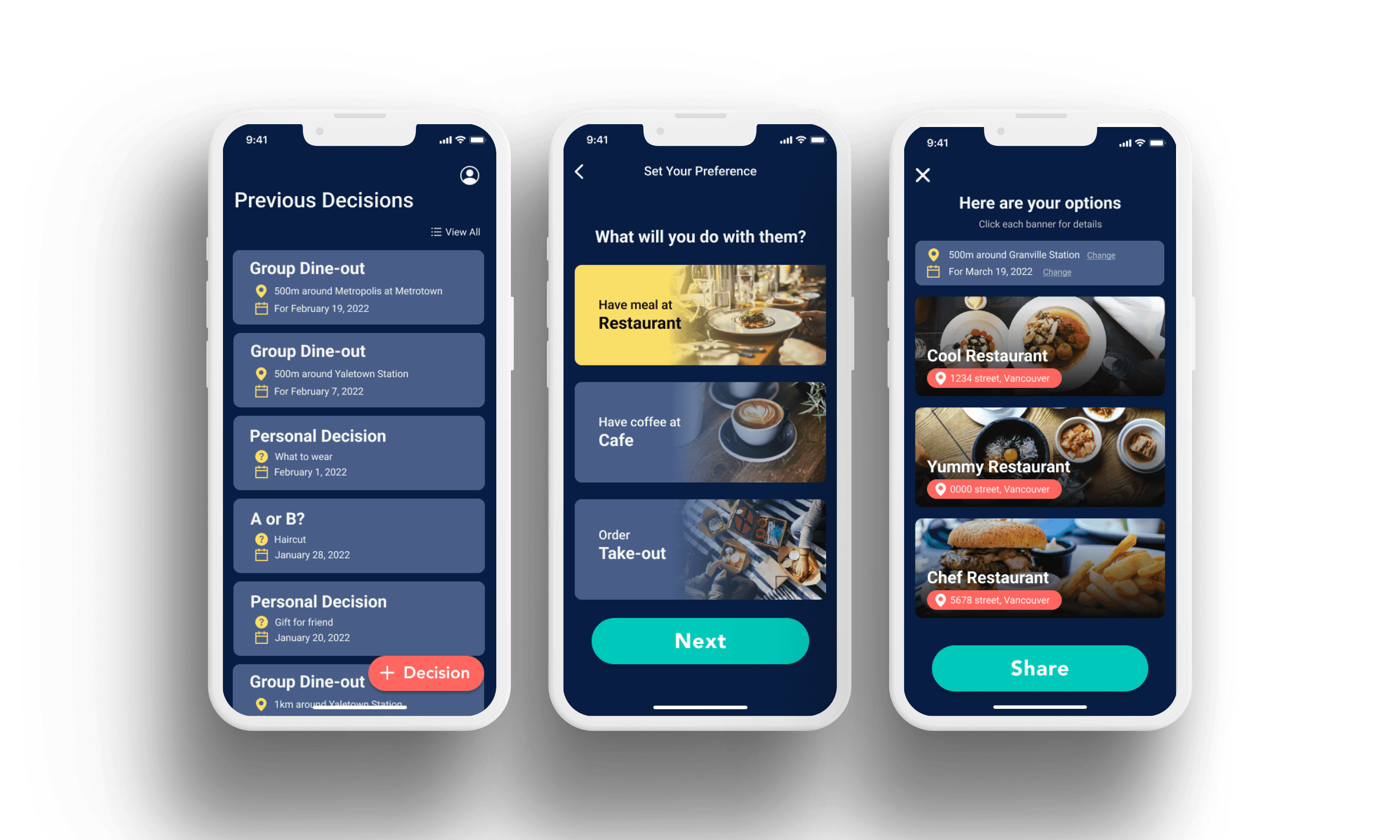
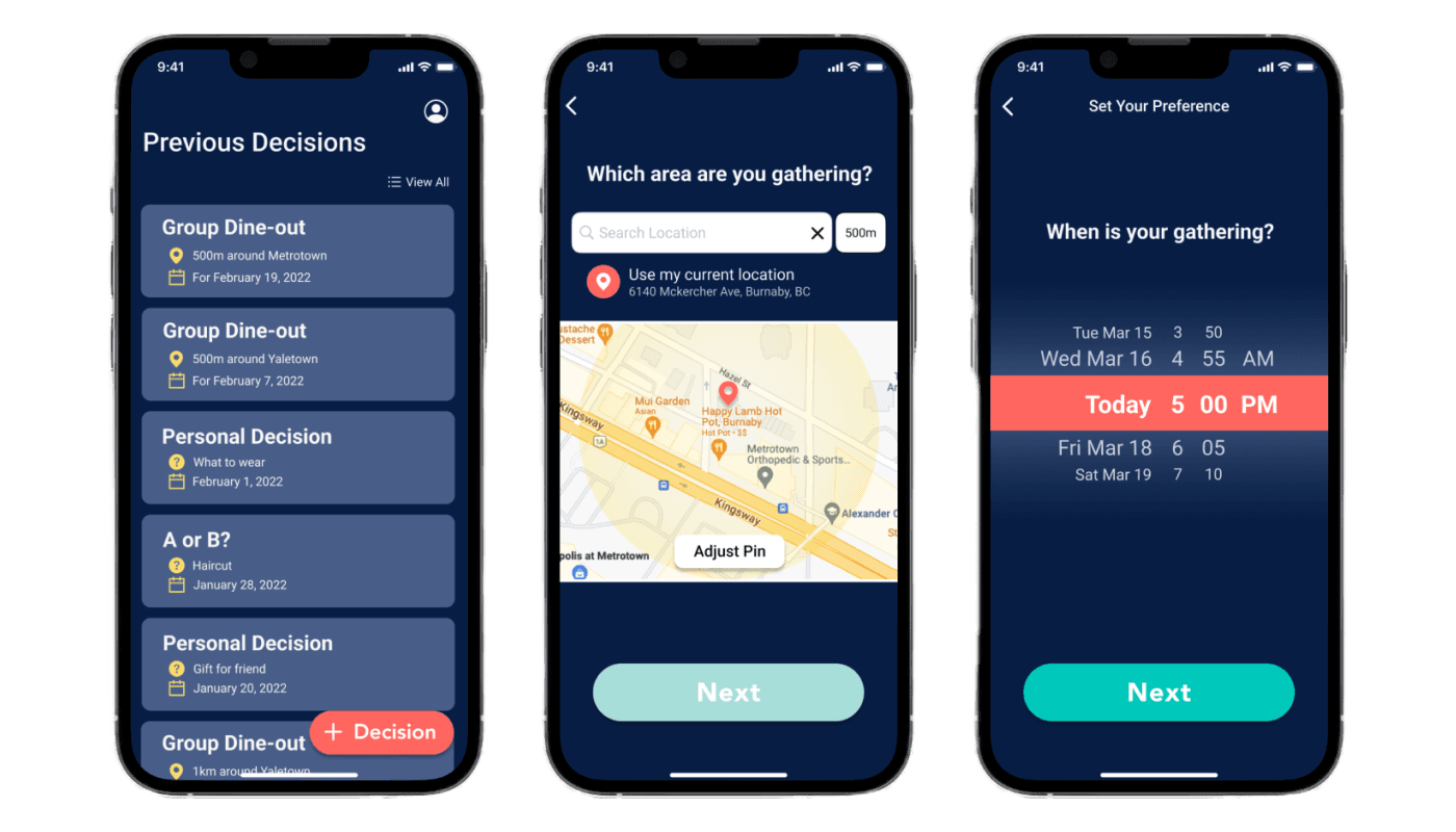
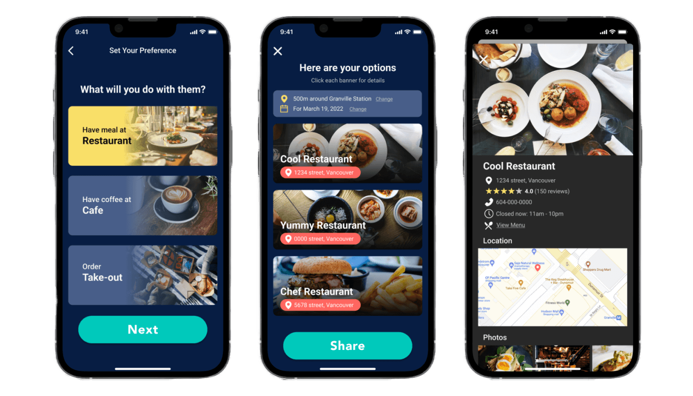
I applied the brand typography and color palette to turn the mid-fidelity prototype into high-fidelity.
Responsive marketing website
As a part of the marketing strategy, I designed the responsive marketing website for the app. The website is designed for desktop view for over 1024px width and mobile view for between 320 to 767px width.
Takeaways
01.
Useful and practical research process
This project’s problem space has a broad spectrum of possible subjects, but secondary research and interviews helped a lot to find an area to focus on. Creating a persona and making experience mapping based on them helped a lot think about problem space and its best possible solution from the user’s perspective. Furthermore, the user stories and task flow helped me a lot to keep myself on track with the subject especially as the project process gets longer.
02.
Importance of user testings and feedback
Multiple user testing sessions and feedback from testers are really constructive and valuable since they make me realize what I didn’t notice or miss. Another thing that I learned from the usability testing sessions is that even though testers from the user testing sessions could successfully complete the given task, there are many opportunities to improve the user experience through iteration.
03.
UX design is not a linear process
Sharing my project idea and work procedure with others during the process gave me chance to look back on my strategy or design to modify it to bring out a better user experience. This may mean giving up part of the current work and going back several steps, but ultimately a profitable choice to enhance the entire process.
Next steps
Next, I plan to conduct further usability testing with my high-fidelity prototype to identify improvement opportunities. I aim to perform A/B testing by adding more preference filters to enhance group dine-out decisions and achieve better user results. Additionally, I will explore task flows like "making a personal decision" and develop accessible, practical screens for efficient user completion.
