Promotion Management
Comprehensive UX design process
with a primary focus on creating MVP
Web app • New module design
Overview
This project centers on Breadstack, an eCommerce business solution platform, aiming to introduce a new Promotion Management module within its existing framework. Prompted by valuable stakeholder feedback emphasizing the potential product value, the initiative embarked on a thorough design process. The project prioritized user-centricity and focused on delivering a Minimum Viable Product (MVP) to enhance Breadstack's functionality and competitiveness in the market.
My role
Secondary research, User interview, User journey/mental model mapping, Sketching(Ideation), Wireframing, Prototyping
How it Started
About Breadstack
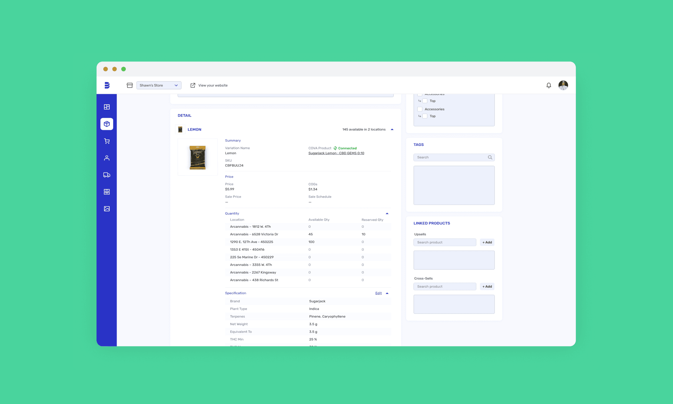
Breadstack is an eCommerce Saas platform that seamlessly integrates sales, operations, marketing, and customer service to streamline functions and boost revenue. As a CXM for eCommerce, it provides essential features such as Product Information Management, Inventory Management, and Order Management, ensuring seamless operations and sustained success for users.

Noticing problem area
We realized many businesses struggle with optimizing sales strategies and managing operations efficiently, a need further highlighted by stakeholder feedback. We hypothesized that tailored features could provide significant market value and differentiation. To validate this, we conducted thorough research and analysis.
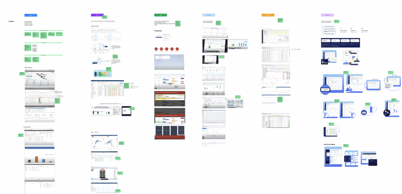
Competitor research
and user interviews
We began by exploring the eCommerce industry, studying market trends, competitors, and user feedback. Through user interviews on promotion planning, we aimed to understand their workflow and pain points.
Competitor research
Build mental model and user journey
Based on interview findings, we built user mental model and user journey map related to promotion management flow.
User journey & Mental model
Strategy
Understanding user needs
Our user research revealed a common desire for a unified interface integrating product management, promotion planning, and storefront management. Users were frustrated with navigating multiple platforms like WooCommerce, Breadstack, and Asana, and the manual effort required to coordinate tasks across different systems.
Our goal
"Create a user-friendly promotion management module for eCommerce owners that unifies product, promotion, and storefront management, reducing manual work and enhancing efficiency."
Scope
Minimum Viable Product (MVP)
For our Minimum Viable Product (MVP), we will prioritize a Promotion Planner for scheduling and managing promotions with a calendar view, Promotion Details for customizing promotions with essential information, and Promotion Performance Data for basic metrics like conversion rates and revenue to evaluate effectiveness and guide future campaigns.
Work within constraints
We faced several constraints: aligning with Breadstack's design system for consistency, using Breadstack's product and sales data for performance tracking, ensuring seamless integration with WooCommerce's API despite constraints, and designing the module flexibly to adapt to varying storefront configurations due to limited control.
Solution
Be creative! Let's brainstorm!
While considering scope and constraints, we had brainstorming sketch session to share most possible creative solutions.
Ideation sketches
Concept mockups
Down-to-earth solutions
Taking into account the resources, time, and effort required, we opted to set aside some of the more ambitious features and instead decided to prioritize the following functionalities:
Calendar view
List view
Creation form
Promotion details
Final design
Going through lots of team feedback sessions and iterations, we landed on the final high-fidelity designs with detailed flows.
Promotion calendar with preview
Promotion list view
Create new promotion
Promotion details
Let's take a step forward
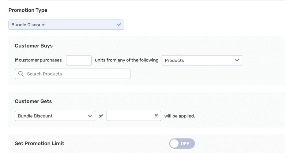
In design review sessions, we identified an opportunity to enhance promotion management by adding an 'Advanced Promotion' feature for more sophisticated formats, like Buy One Get One X% off and Cart Value more than $X Get $X off. This required adjustments to the promotion creation form design, which we wanted to explore further.
Example for advanced promotion

New challenges appeared
Take a step back and iterate
We decided to exclude advanced promotions for this phase but updated the simple promotion flow by reducing steps for setting sale prices, clarifying included products, and simplifying the addition of promotional items. This update received positive feedback for improving intuitiveness and simplicity.
Revised promotion creation flow
Project outcome
After releasing the new promotion module, stakeholders and users praised its user-friendly interface and effectiveness in daily operations. Users have already launched hundreds of promotions, driving ongoing business growth.
100% adoption rate
100+ promotions created by users
What Happened Next?
Extend to another platform
Our team redirected focus towards redefining the role and functionality of promotions within our live chat support platform. This involved exploring avenues to integrate and enhance the promotional experience for clients utilizing both products.
Service blueprint across softwares
Takeaways
01.
Importance of understanding user journey and mental model
By deeply understanding user needs and behaviors, we crafted intuitive interfaces that aligned seamlessly with user workflows and mental models. This user-centric approach enhanced usability, driving stronger user engagement and satisfaction, emphasizing the critical role of empathy and user-centered design in creating impactful solutions.
02.
Focus on building an MVP
Throughout the design process, we encountered the temptation to incorporate advanced features prematurely, even before completing the first phase. However, given the constraints of time and resources, we quickly recognized the necessity of prioritizing the Minimum Viable Product (MVP). This experience underscored the importance of strategic decision-making and discipline in focusing on essential functionalities to deliver value to users efficiently.
03.
Power of collaboration
Collaboration proved to be an indispensable asset at every stage of the project. From ideation to implementation, every step involved collective efforts and continuous feedback from team members. This collaborative approach fostered creativity, innovation, and a shared understanding of project goals. Leveraging diverse perspectives and expertise within the team enabled us to address challenges effectively, uncover insights, and deliver a cohesive, user-centric solution.


